

Harvesting Hues
From Photographs to Color Palettes
We walk past amazing colors every day: rust on a car, moss on a tree, varied pebbles warming in the sun. Usually we don’t think much of it, but when we slow down a little, we can find artistic inspiration anywhere.
Color is also a memory marker. I can still remember the color of my favorite chapstick I had growing up, the shade of gray on my first car and the red rocks that were always scattered around my favorite beach.
I like collecting moments from my life by pulling color palettes out of my photographs. It’s simple: take a picture you love, sample a few colors and save them as a palette. They’ve become my favorite tiny keepsakes.
Sometimes I use those palettes to start a bigger art project. Other times, they’re just a fun five minute exercise for noticing new things.
In this post I’ll share a few palettes I’ve made from travel photos and everyday snapshots, along with what they inspired. Maybe it’ll spark an idea for you too, or just give you a reason to pause and look a little closer at the colors that have been around you.
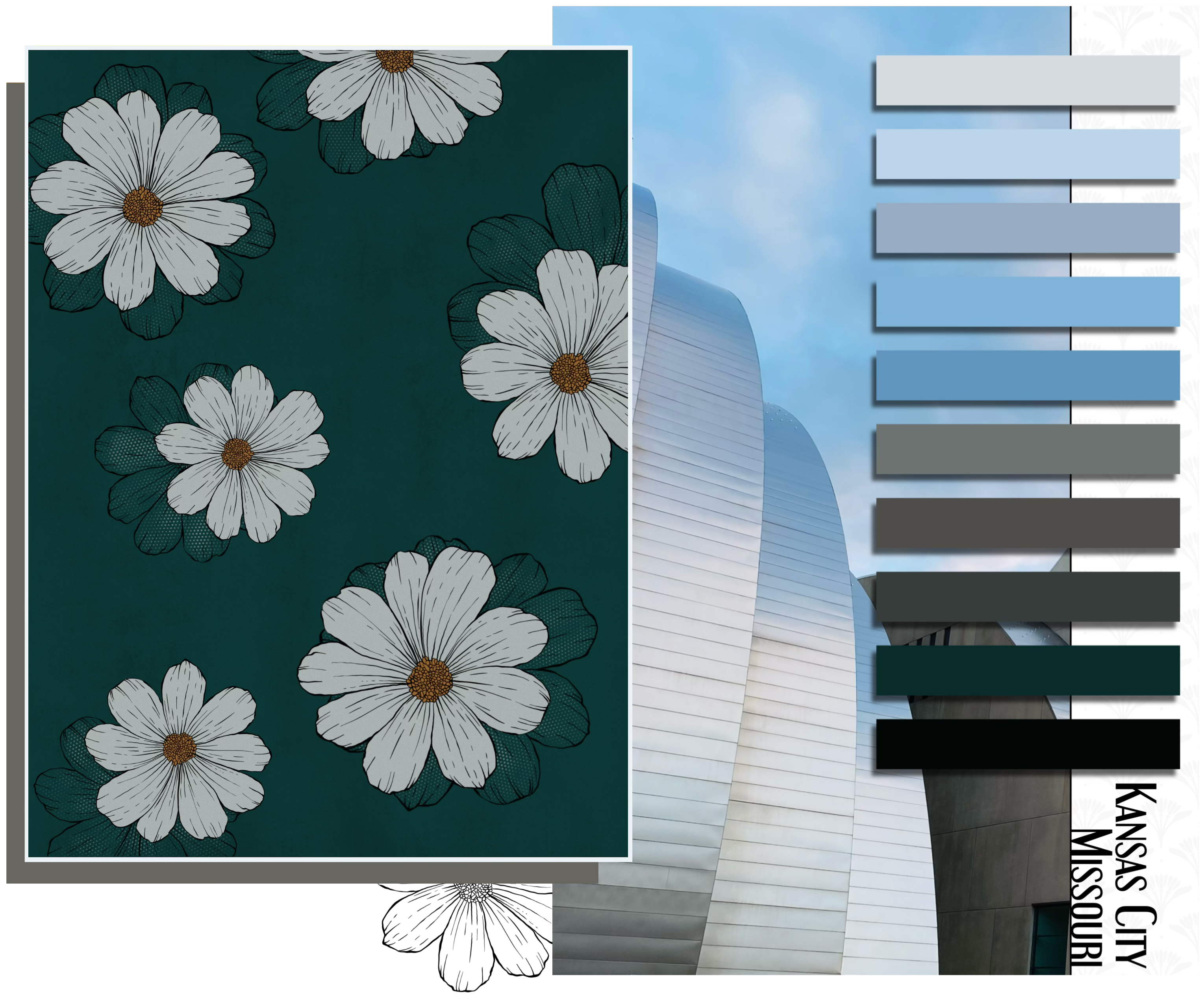
Kansas City, Missouri
“Steel Petals”
The photo: A quick click from an impromptu trip to Kansas City, taken as we walked past the Kauffman Center right before sunset. The light caught the curves of the building in a way I couldn’t ignore — so sleek!
The palette: I pulled these colors months later as a memory marker, just one of the ways I like to honor moments that mean a lot to me. That day happened to be a turning point in my marriage. For the good, don’t worry!
The artwork: Inspired by the stainless facade, I wanted to impart something of the industrial feel into these flowers. So, tiny rivet points appeared in their shadow. I only used two colors from the palette. Does that matter? Not at all. Sometimes just starting is the point. Pick what calls to you and make a mess.
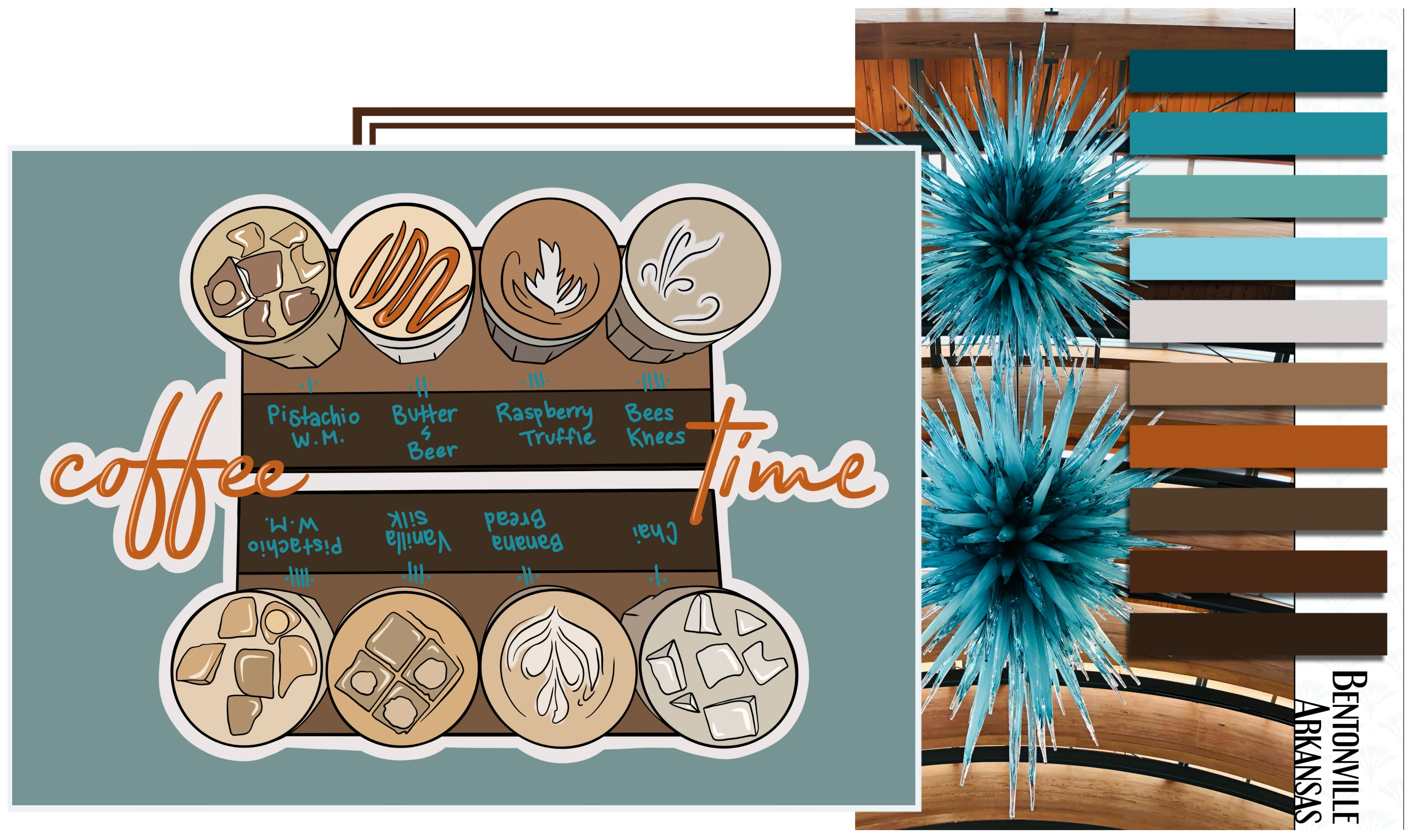
Bentonville, Arkansas
“Glass Coffee”
Two completely unrelated things: a glass-blown sculpture at Crystal Bridges… and a coffee flight that made my heart pound.
The only thing connecting these photos are the colors: ice blue, dark roast, milk foam, warm maple wood. Chaos and comfort, side by side, just how I felt when I realized caffeine and I are no longer friends.
A silly goodbye to colors I really shouldn’t sip ever again.
Using a palette doesn’t mean a strict adherence to “the rules. The colors I used in my sticker aren’t all seen in the swatches, but they live in between the other colors. If reading between the lines is allowed in literature and life, then I think drawing between the shades should be too.
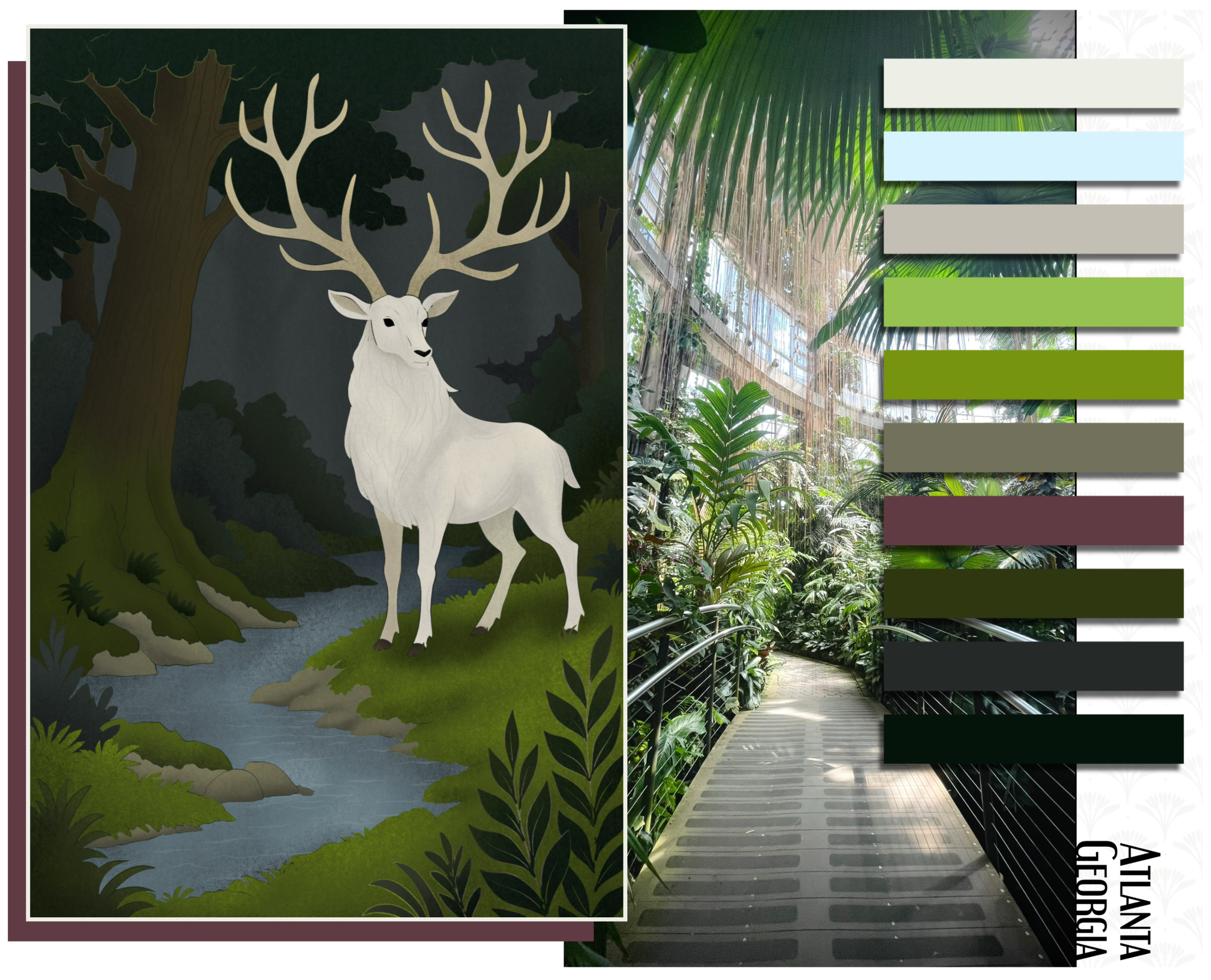
Atlanta, Georgia
“River’s Path”
It was truly HOT-lanta the day I took this photo. The midday heat was really pressing in. With only one day left in Georgia, there was just one thing left on my list… the gardens. Just one problem: it was August. I melt in the heat.
But, I worked up the gumption and wandered through the botanical gardens anyway, and oh wow, I’m glad I did. The garden was overwhelming in every way, lush and humming with energy (and humidity).
There was a little bridge tucked into one of the greenhouses and I stopped for it. I always seem to take pictures of bridges. They feel like the start of a grand story… as if some great adventure is about to begin, if only you were paying attention.
When I made this palette, I loved how many shades of green were packed into that one frame. Chartreuse, moss, ivy, blackish green, all anchored by the rich soil tones and soft daylight.
I wanted this piece to feel like a page from a well loved fantasy book—something between Tolkien and childhood memories. The stag is always what I imagine at the beginning of a fantasy. Something waiting to scare away the shadows. My symbol of hope.
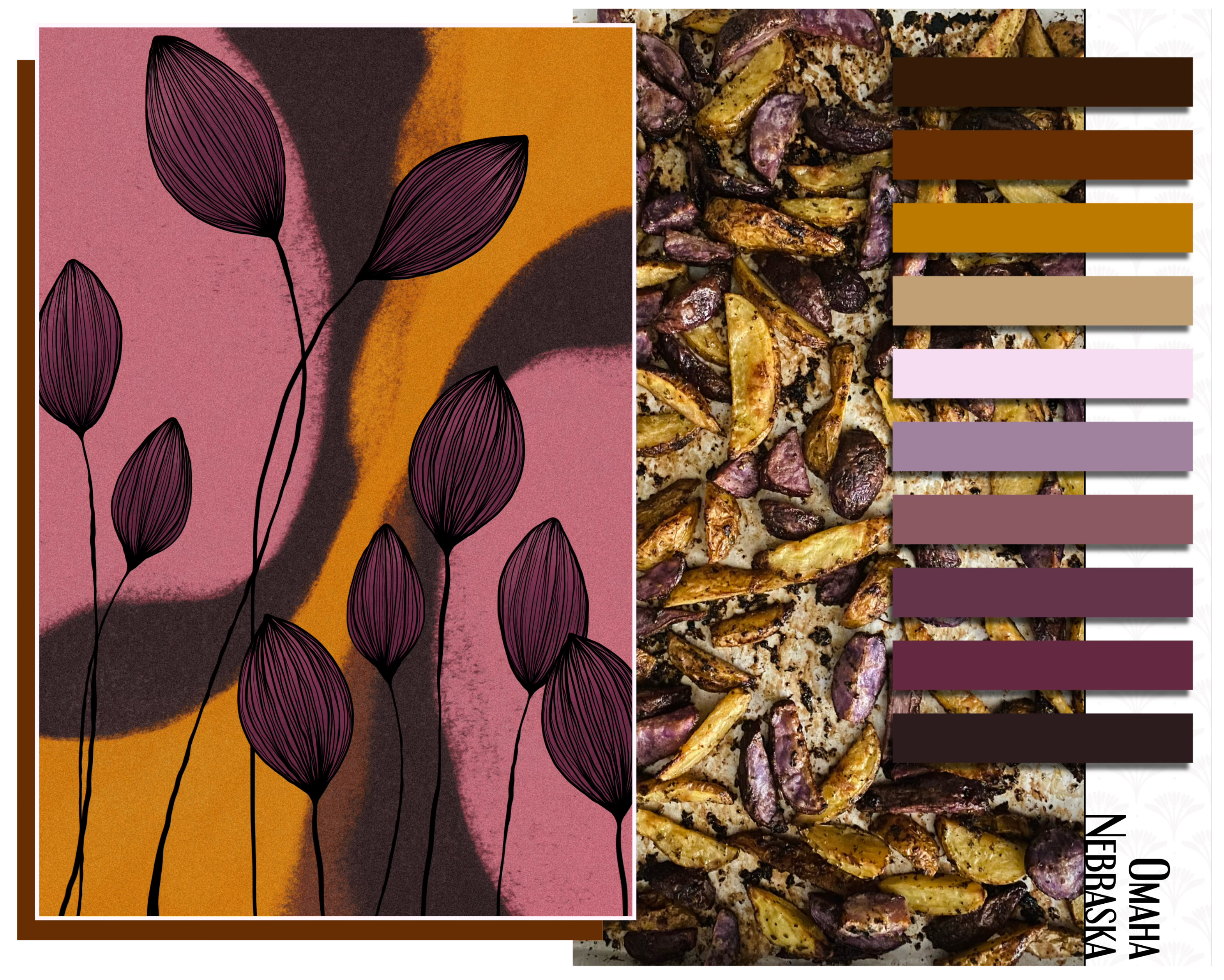
Omaha, Nebraska
“Floral Abstraction”
These potatoes were a farmers market find. Purple and gold and beautiful. I quickly roasted them with lemon, herbs and a bit of olive oil and they were gone almost as fast as they came out. But I snapped a photo before the tray disappeared. The colors were too good to just eat.
This piece was me just playing around, an experiment with abstract, which is one of my favorite art styles. I started with three colors I liked together and let them move and overlap. A fourth color snuck in during the shifting and I thought it still fit.
The lined florals came when I wasn’t ready to stop drawing. Adding small details, layering color into the centers. Just letting go.
Everyone should have time like that with art.
Unstructured — surprising — full of deep breaths.
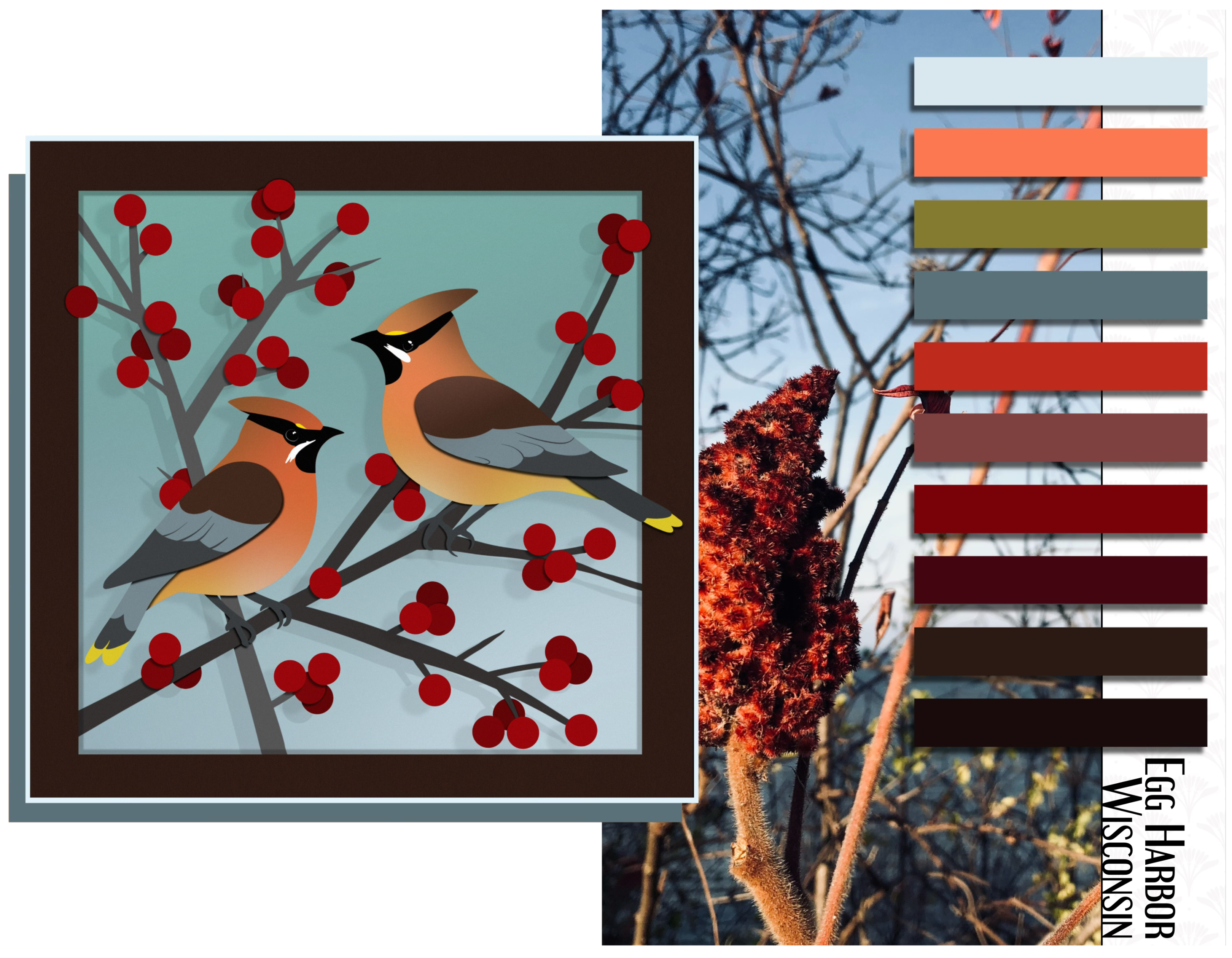
Egg Harbor, Wisconsin
“Sumac Waxwings”
This one’s different from the others. Most of the time it takes me months (or a few years) before I turn some of these photos into their own palettes. It’s a way of reliving moments that have already passed. But this photo? It’s the only one (so far) I’ve taken because of a moment I’d just had.
I’m a birder. A bad one. See here:

I always seem to miss the birds. But that day, I finally saw them! My first Cedar Waxwings. Smooth and sleek and super smug about their looks. I’d been trying to find these suckers for so long.
The photo came from the same area I spotted them but I wasn’t quick enough back then to photograph the actual Waxwings themselves. So I looked for the right light, the red sumac and the bay beyond the branches. It was part of the same moment and I wanted these two pieces to reflect the moment together.
The art style here mimics paper cut art: sharp edges with color blocked shadows. I just wanted it to feel bold. It felt like the right way to remember that little bird who took so long to find.
Current life list: 154.
The cedar waxwing was number 61…
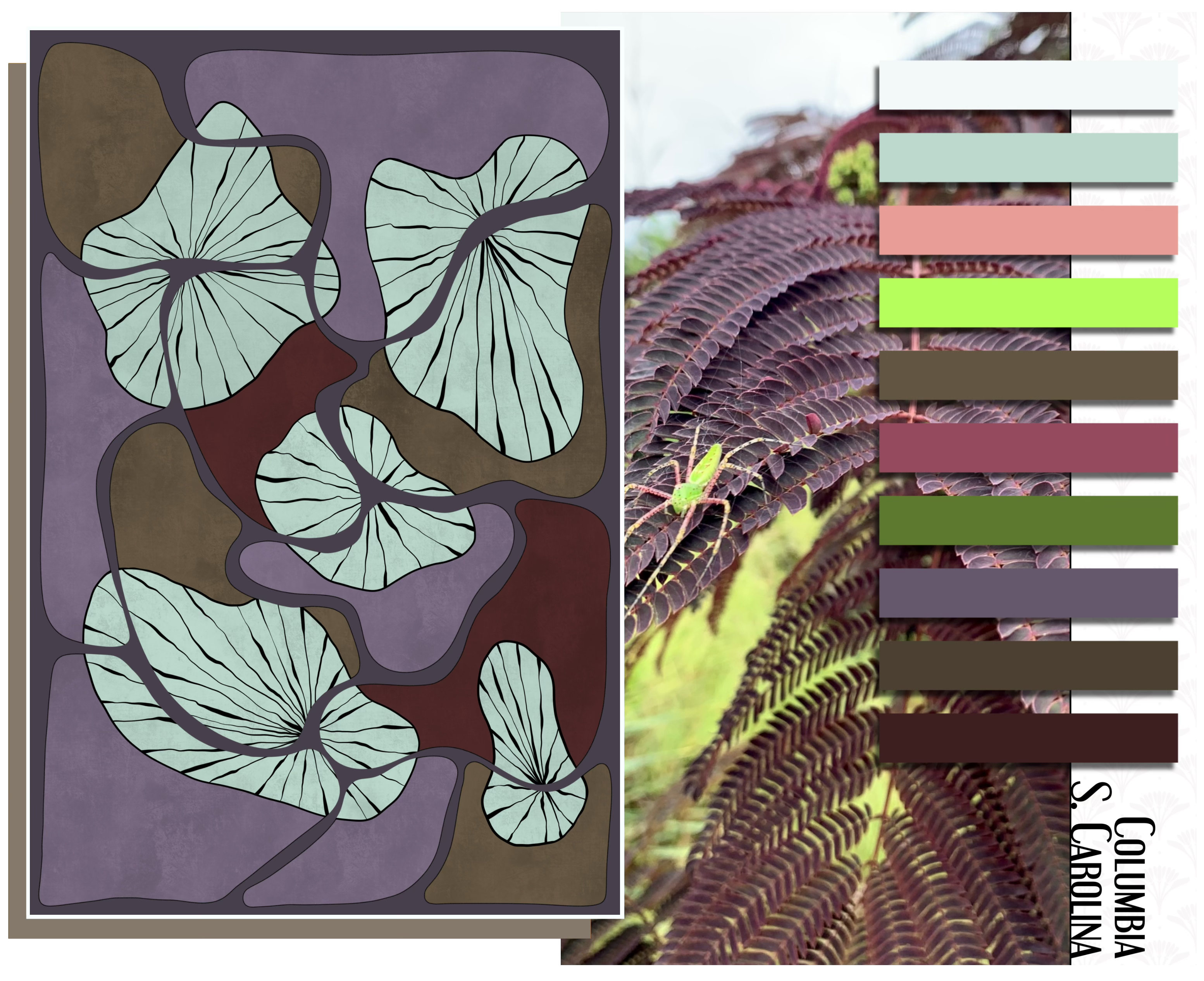
Columbia, South Carolina
“Studiously Purple”
I intended this photo to be a simple little color study. The purples on that fern were so varied and I was trying to capture that spectrum of a single color within one plant. That’s all I thought I was getting...
Then later, I zoomed in closer and there it was — a spider! Bright green with pink legs. Absolutely invisible to me in the moment, yet frighteningly unmissable after the fact.
I have no idea how I got that close without noticing. It still makes my skin crawl. And yes, you’re correct, I now religiously check for spiders.
The piece I ended up making from this palette is abstract and strange. It’s one of my favorite things I’ve ever done digitally. The black lines might be spider legs, or they might not. I didn’t plan it. But now I wonder... and I did leave the green of the spider out on purpose. Maybe from spite.
Collecting Color & How I Do It
Everything you’ve seen in this post was done in Procreate — a $12.99 app that turns any tablet into a full art studio. That’s not an ad (you won’t ever find those here). It’s just the truth.
I think everyone should have a space like this: portable, pressure free and permanent. You buy it once and it’s yours. No subscriptions. No catch.
It takes surprisingly little time to learn and the tools grow with you. Whether you’re making full illustrations or just pulling colors from a photo you love. This tool gives you freedom to try something new without needing to know where it’s going or having to go buy new supplies.
That’s the whole point of this post. Creating and enjoying.
A color palette doesn’t have to end in a masterpiece to be worthwhile. Sometimes it leads to incredible illustrations. Other times, to total flops. But even then, bad art can still be good art.
If it brings joy or helps you to keep creating and growing, that’s reason enough. And sometimes, a palette doesn’t need to lead anywhere at all. It can simply exist. A preserved moment. A story in color. The mood of a day.
You can hang them as art and grow your own collection.
Print them as postcards and mail that memory to someone you love.
Let it inspire a seasonal menu — how could you cook in those colors?
A starting point for journaling, describing each color and mood.
Or keep them tucked away to look at when the seasons change and you want to remember how the light felt in July.
Sometimes, a palette can be just what it is — something that made you happy.
Something that made you stop and notice.
Something that helps you remember.
There are so many different layouts to use and your imagination is the limit.
For me, building palettes helped me feel like an artist — even when I was still just pretending to be one.
Before you go…
Harvests are meant to be shared.
If you enjoyed the art shared in this post, I’ve pulled some of this art into wallpapers — already (generally) sized for a phone, tablet or desktop.
A small keepsake, from my seasons to yours.
The pieces I’ve used are:
“Studiously Purple” — “Floral Abstraction” — “Steel Petals”
Since they are higher quality files, you’ll have to go to my Gumroad to download them. I’ve organized them into Phone, Desktop and Tablet collections that you can access for free.
— Visit Here —